Posts (page 17 of 43)
-
In Sergio Leone’s epic three-hour western, The Good, the Bad, and the Ugly, the three main characters form shifting, uneasy alliances as they search for a cache of stolen gold. To quote Blondie (the Good), “Two hundred thousand dollars is a lot of money. We’re gonna’ have to earn it.”
Bug bounties have a lot of money. But you’re gonna’ have to earn it.
And if you’re running a bounty program you’re gonna’ have to spend it.

As appsec practitioners, our goal is to find vulns so we can fix them. We might share the same goal, just like those gunslingers, but we all have different motivations and different ways of getting there.
We also have different ways of discovering vulns, from code reviews to code scanners to web scanners to pen tests to bounty programs. If we’re allocating a budget for detecting, preventing, and responding to vulns, we need some way of determining what each share should be. That’s just as challenging as figuring out how to split a cache of gold three ways.
My presentation at Source Boston continues a discussion about how to evaluate whether a vuln discovery methodology is cost-effective and time-efficient. It covers metrics like the noise associated with unfiltered bug reports, strategies for reducing noise, keeping security testing in rhythm with DevOps efforts, and building collaborative alliances in order to ultimately reduce risk in an app.
Eternally chasing bugs isn’t a security strategy. But we can use bugs as feedback loops to improve our DevOps processes to detect vulns earlier, make them harder to introduce, and minimize their impact on production apps.
The American West is rife with mythology, and Sergio Leone’s films embrace it. Mythology gives us grand stories, sometimes it gives us insight into the quote-unquote, human condition. Other times it merely entertains or serves as a time capsule of well-intentioned, but terribly incorrect, thought.
With metrics, we can examine particular infosec mythologies and our understanding or appreciation of them.
With metrics, we can select and build different types of crowds, whether we’re aiming for a fistful of high-impact vulns from pen testing or merely plan to pay bounties for a few dollars more.
After all, appsec budgets are a lot of money, you’re gonna’ have to earn it.
-
Start at Zero with the OWASP Top 10 Apr 24, 2017
Engineering is an exercise in working within constraints. Appsec increases those constraints, forcing developers to better understand the nuances of vulns and then decide how to prioritize and fix them.
Since 2003 the OWASP Top 10 has raised awareness of the types of weaknesses that plague web apps and the kinds of attacks that target them. Even trying to fit the abundance of attacks and weaknesses into a top ten list is an exercise in working within constraints. For their part, OWASP chose to label the entries as risks and refine the list by criticality.
The recent update for 2017 proposes two new entries, both of which strive to capture complex subjects under the constraints of 2–3 words. The next two sections summarize these new entries, A7 and A10.
A7. Insufficient Attack Protection
Insufficient attack protection (A7) covers the concepts of protect, detect, and respond to attacks against an app. These concepts echo three of the five functions named in the NIST Cybersecurity Framework. It’s a heavily overloaded item whose subtext is about asset inventory (where are your legacy apps) and risk management (how much should you invest in security tools for your apps).
Detection should be tied to response decisions and whether you actually care about that information or will take action on it. Log collection and monitoring has its place in standard DevOps practices for analysis and debugging of an app’s health. Adding “attack” alerts is only useful if you have a plan for reacting to them; otherwise they’re just noise and data that don’t convey information. There’s a distinction between traffic that has attack-like properties and traffic that is exploiting weaknesses in the app.
What’s notable about A7 is that it calls out additional components like IDS, WAF, and RASP to add the app’s ecosystem. For legacy apps, these might make sense since their deployment can be more cost-effective than rewriting code. For other apps, this trade-off may not make sense. Again, we’ve returned to a risk management decision that requires context about the app.
Also under this item’s description is the ability to patch quickly. This decision tree also branches between legacy apps and active apps. Legacy apps might benefit from WAF solutions whereas apps with active DevOps should have capabilities to deploy patches out of regular release cycles.
A10. Underprotected APIs
Underprotected APIs (A10) is an equally overloaded item, but more in the sense that it’s a reminder that the Top 10 items A1 through A9 apply equally to APIs. Modern web apps are often split between JavaScript-heavy frontends that interact with REST-based API backends via HTTP requests. Similar APIs may also serve native mobile apps, or be designed for other web apps to interact with.
In other words, appsec applies to endpoints that serve more than just web browsers. Those API endpoints may still have authentication weaknesses, cross-site scripting issues, or other vulns. And security testing should cover them as well.
Like A7, this relates to asset inventory (web-based APIs that aren’t for browsers are still web apps) and risk management (APIs need security testing, too).
Start with Zero
When we encounter constraints we must ask questions in order to make informed decisions. Both A7 and A10 have a basis in web asset inventory and risk management. This is like searching for the answers to, “What apps do I own, what weaknesses do they have, and how much effort should I put into them?”
Another way to frame this is in the vein of the OWASP Top 10 might be as the following zeroth entry:
A0. Under-developed risk classification
The spirit of this entry is to equip your DevOps (or DevSecOps) team with the tools to describe the risk associated with the OWASP Top 10 entries, evaluate that risk, and prioritize ways to reduce it.
Security testing will help answer the question about how much risk your app has now. There are many ways to do this, from code reviews to source code scanners to dynamic scanners to bug bounties and pen tests.
For example, pen tests identify weaknessess and vulns within a web app or API. Experienced pen testers can also provide insight into the impact a vuln might have on the app, its data, or its users; and the likelihood (or ease) of that vuln’s exploitation. That information plus context about the app’s criticality to business operations or the revenue it supports all contribute to its risk.
A DevOps team should strive to reduce risk over time by improving code, making design changes, increasing the speed at which patches can be deployed, or adding security tools like a WAF. By tracking risk over time, you can monitor trends and set goals to reduce risk by measurable amounts.
Consistent classification and tracking also leads to insights about how an app compares with others. The following graph is an example of visualizing relative risk. It plots apps relative to each other based on their average risk and number of vulns. (Read this post to better understand this graph.)
We can’t build apps that are perfectly secure against all threats, but we can manage the risk they accrue from vulns and the attacks they face. Classifying and qualifying vulns helps teams work more effectively within the constraints of secure app development. It informs the way we answer questions like, “How much should I worry about this app and what’s the first step I should take to protect it?”
Risk management, like app development, is a continuous process. The OWASP Top 10 gives DevOps teams a security reference. They can use it to classify vulns discovered by security testing, rate those vulns, and prioritze how to fix them — ideally improving deployment processes along the way.
-
Measuring Endemic Risk in AppSec Apr 10, 2017
Software has vulns. It will always have vulns. Try writing a multi-paragraph email without typos or grammatical blunders. People make mistakes.
Security testing should discover these mistakes — whether by static code analysis, dynamic scanners, pen tests, bug bounties, or other activities. Security teams also strive to evaluate just how bad those mistakes are. They go through risk exercises such as determining the various ways a vuln impacts an app.
Quantifying risk remains more art than science. One challenge is that a component like impact contains several dimensions — loss of revenue, loss of users, loss of data, and so on. For this article, we’ll consider risk as a simplified combination of likelihood (how easy it may be to successfully exploit a vuln) and impact (how exploitation of a vuln affects an app’s data or business operations).
Peer Plots
Even rough metrics can be useful. One use is to track trends and examine whether particular security efforts influence them. Another is to compare them against peers, essentially asking, “Am I doing better or worse than someone else?”
The following graph weakly answers this question. It shows risk as a combination of impact and likelihood, plotting the average risk of all findings within each pen test (R) along those axes.
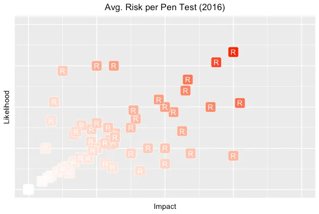
For these pen tests, there seems to be a slight bias towards likelihood over impact. This could be explained by the nature of pen testing since valid findings have some degree of demonstrated exploitability. When a vuln is theoretical or based on conjecture, there’s often pushback to ensure that its threat (or attack) model is justified.
Concise Charts
Sometimes, we can use more data to convey a stronger message. (And must be careful not to dilute the message with too many dimensions or irrelevant data.) A successful visualization will tell a compelling story, or at least be the seed for a rich discussion.
The following graph attempts to answer a slightly different question: “How worried should I be about my app?”
Each point (R) represents the number of findings and average risk of those findings for a pen test. Note how the interplay of axes shifts our perception of risk when we display them against averages within the overall population.
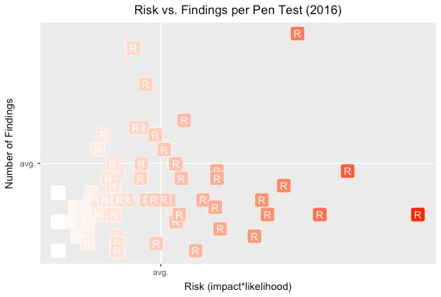
By showing the number of findings in each pen test, we hope to add context about the potential effort to reduce the app’s risk. Lots of findings might imply lots of different vulns to fix, but they might also be indicative of a single design flaw. Either way, there’ll be lots of work to do.
A lower-risk app lands in the lower-left quadrant. The riskiest ones land in the the upper-right quadrant. In all cases, landing in an above-average area leads to questions like, Does this app have fundamental design flaws? Does it have a significant type of vuln skewing its risk?
Qualifying Quadrants
Despite claiming that software always has bugs, we shouldn’t accept buggy software. In epidemiological terms, we expect there to be a baseline or endemic level of flaws within apps. A mature security development lifecycle should help an app fall below that baseline.
I have a strong preference for using a health metaphor for application security — treating vulns as treatable and preventable dangers. In this way a security team might be like the Centers for Disease Control and Prevention (CDC). The CDC tracks things outbreaks. Important things. Things that threaten our health. Things like zombie outbreaks.
One way this idea might inform security is acknowledging that some level of baseline vulns will always exist and that perfect security is a misguided goal. (Just as people are never “100% healthy”. At the very least, we all age.)
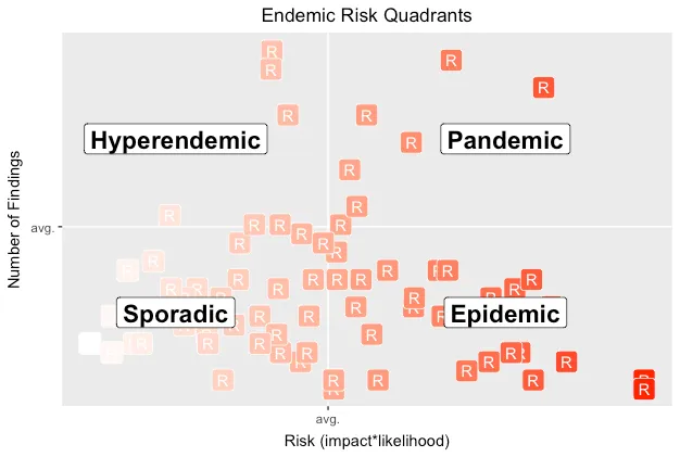
Another way this metaphor might inform security is by reconsidering the previous risk chart in terms of endemic disease occurrence — the amount of disease (vulns) in a community (app). In other words, if we expect that some vulns will be present in an app, how should our response change when we find one? How does its presence inform priorities or change our understanding of the app’s risk?
The CDC defines different levels of disease occurence. From an appsec persepective, we might reinterpret these levels as follows:
Sporadic — Infrequent and irregular; the lower left quadrant (below-average risk & findings). This might imply that vulns are due to easily-addressed implementation mistakes.
Hyperendemic — Persistent, high levels of occurence; the upper left quadrant (below-average risk, above-average findings). This might imply that vulns are less often impactful to the app, but that devs keep introducing them — perhaps due to lack of testing that would otherwise catch regressions, or lack of reusable code to centralize security barriers.
Epidemic — Increase in occurrence above normal expectations; the lower right (above-average risk, below-average findings) quadrant. This might imply that a few significant vulns are putting the entire app at risk.
Pandemic —A widespread epidemic; the upper right (above-average risk & findings) quadrant. This might imply that the app’s design has significant issues, such that the implementation is weak and not easily fixed. It’s often what happens the first time an app goes through a pen test.
The following chart overlays endemic quadrants onto the pen test risks.
Looking at relative pen test results can inspire many questions and suggest many hypotheses to test. It also helps us estimate how much effort may be required to reduce risk, and shows us progress over time as we invest resources into shifting an app’s risk into the lower-left corner.
It’s most important to discover the root cause for how vulns crept into production apps, and to conduct postmortems to determine when a vuln might be due to an easily correctable mistake or the consequence of a weak design. Vulns happen. Work to make them a rare occurrence. Conduct security tests often. Measure risk. Prevent outbreaks.