Measuring Endemic Risk in AppSec
• Mike Shema
Software has vulns. It will always have vulns. Try writing a multi-paragraph email without typos or grammatical blunders. People make mistakes.
Security testing should discover these mistakes — whether by static code analysis, dynamic scanners, pen tests, bug bounties, or other activities. Security teams also strive to evaluate just how bad those mistakes are. They go through risk exercises such as determining the various ways a vuln impacts an app.
Quantifying risk remains more art than science. One challenge is that a component like impact contains several dimensions — loss of revenue, loss of users, loss of data, and so on. For this article, we’ll consider risk as a simplified combination of likelihood (how easy it may be to successfully exploit a vuln) and impact (how exploitation of a vuln affects an app’s data or business operations).
Peer Plots
Even rough metrics can be useful. One use is to track trends and examine whether particular security efforts influence them. Another is to compare them against peers, essentially asking, “Am I doing better or worse than someone else?”
The following graph weakly answers this question. It shows risk as a combination of impact and likelihood, plotting the average risk of all findings within each pen test (R) along those axes.

For these pen tests, there seems to be a slight bias towards likelihood over impact. This could be explained by the nature of pen testing since valid findings have some degree of demonstrated exploitability. When a vuln is theoretical or based on conjecture, there’s often pushback to ensure that its threat (or attack) model is justified.
Concise Charts
Sometimes, we can use more data to convey a stronger message. (And must be careful not to dilute the message with too many dimensions or irrelevant data.) A successful visualization will tell a compelling story, or at least be the seed for a rich discussion.
The following graph attempts to answer a slightly different question: “How worried should I be about my app?”
Each point (R) represents the number of findings and average risk of those findings for a pen test. Note how the interplay of axes shifts our perception of risk when we display them against averages within the overall population.

By showing the number of findings in each pen test, we hope to add context about the potential effort to reduce the app’s risk. Lots of findings might imply lots of different vulns to fix, but they might also be indicative of a single design flaw. Either way, there’ll be lots of work to do.
A lower-risk app lands in the lower-left quadrant. The riskiest ones land in the the upper-right quadrant. In all cases, landing in an above-average area leads to questions like, Does this app have fundamental design flaws? Does it have a significant type of vuln skewing its risk?
Qualifying Quadrants
Despite claiming that software always has bugs, we shouldn’t accept buggy software. In epidemiological terms, we expect there to be a baseline or endemic level of flaws within apps. A mature security development lifecycle should help an app fall below that baseline.
I have a strong preference for using a health metaphor for application security — treating vulns as treatable and preventable dangers. In this way a security team might be like the Centers for Disease Control and Prevention (CDC). The CDC tracks things outbreaks. Important things. Things that threaten our health. Things like zombie outbreaks.
One way this idea might inform security is acknowledging that some level of baseline vulns will always exist and that perfect security is a misguided goal. (Just as people are never “100% healthy”. At the very least, we all age.)
Another way this metaphor might inform security is by reconsidering the previous risk chart in terms of endemic disease occurrence — the amount of disease (vulns) in a community (app). In other words, if we expect that some vulns will be present in an app, how should our response change when we find one? How does its presence inform priorities or change our understanding of the app’s risk?
The CDC defines different levels of disease occurence. From an appsec persepective, we might reinterpret these levels as follows:
Sporadic — Infrequent and irregular; the lower left quadrant (below-average risk & findings). This might imply that vulns are due to easily-addressed implementation mistakes.
Hyperendemic — Persistent, high levels of occurence; the upper left quadrant (below-average risk, above-average findings). This might imply that vulns are less often impactful to the app, but that devs keep introducing them — perhaps due to lack of testing that would otherwise catch regressions, or lack of reusable code to centralize security barriers.
Epidemic — Increase in occurrence above normal expectations; the lower right (above-average risk, below-average findings) quadrant. This might imply that a few significant vulns are putting the entire app at risk.
Pandemic —A widespread epidemic; the upper right (above-average risk & findings) quadrant. This might imply that the app’s design has significant issues, such that the implementation is weak and not easily fixed. It’s often what happens the first time an app goes through a pen test.
The following chart overlays endemic quadrants onto the pen test risks.
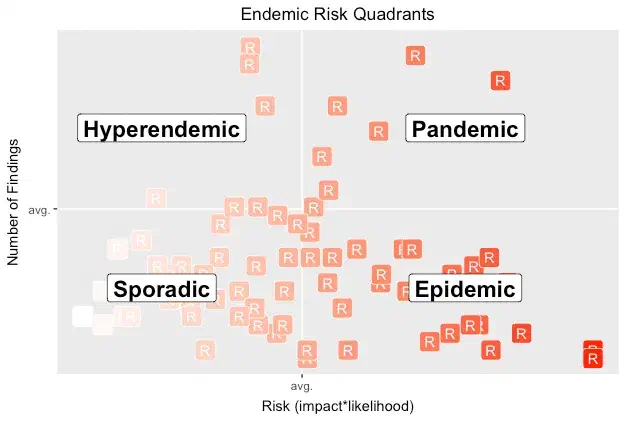
Looking at relative pen test results can inspire many questions and suggest many hypotheses to test. It also helps us estimate how much effort may be required to reduce risk, and shows us progress over time as we invest resources into shifting an app’s risk into the lower-left corner.
It’s most important to discover the root cause for how vulns crept into production apps, and to conduct postmortems to determine when a vuln might be due to an easily correctable mistake or the consequence of a weak design. Vulns happen. Work to make them a rare occurrence. Conduct security tests often. Measure risk. Prevent outbreaks.